This article is for the new Clarity interface. Screenshots and descriptions will be updated as features are released.
Table of Contents
Overview
The new Clarity Human Services interface was designed to be easy to use and pave the way for future enhancements. The new Clarity interface includes tools for collecting and managing data for reporting, case management, and coordinated care.

Note: The tabs and sections available to each end user are determined by the community's system administrator. Each section seen in the screenshot above may not be available to all end users. If you think you are missing a section necessary for your workflow, please reach out to your system administrator or agency contact.
Navigation
The new Clarity interface is loaded with navigation tools, providing users with one-click access to their next task.
Information Bar
The Information Bar is always visible in the new Clarity interface and contains icons for Dark Mode, a Global Search, Switching Interfaces, and the current Staff Member. The Information Bar also shows Breadcrumbs (if any), the User’s Name, the Agency they are currently switched into, and a drop-down arrow for access to any additional agencies.

Dark Mode
Users can switch to dark mode in the new Clarity interface by clicking the Moon icon. More details about dark mode are included in the Customization section of this article.
Global Search
An additional client search option is available by clicking on the Search icon in the Information Bar.

This client search option is available throughout the new Clarity interface. When you click the Search icon, a modal opens that functions like the Client Search page, with recently accessed clients, Filter options, a Column Selector, and an Add (+) icon (to add a new client).

Switch Interface Icon
An important navigation tool in the new Clarity interface is the ability to switch between the current and the new interface. Click on the pop-out icon in the Information Bar to switch the interface.
Click on the same icon in the current interface to switch back.
Current Staff Member
The Information Bar displays an icon with the current user’s initials or custom image. To the right of this icon is the current user’s name, the agency they are currently switched into, and a drop-down icon.

Clicking any of these items or anywhere in this area opens a page where the user can either Switch Agencies or update their Staff Member Account Settings.
For more information about switching agencies, refer to the Switching Agencies article. For more information about updating account settings, refer to the Staff Member Account Settings article.
Breadcrumbs
Users can easily see their location by reviewing their breadcrumbs in the Information Bar at the top left of their screen.

As the user navigates the new Clarity interface, the system leaves a breadcrumb trail showing their location. Users can click a breadcrumb to move to that location, or click the Action Menu icon to access more breadcrumbs.

Primary Navigation Menu
The primary navigation menu on the left side of the screen is always visible, so you can easily move from one tab to another. You can collapse the tabs with the double arrow at the bottom of the list of tabs, but continue to move from one tab to another by clicking on the tab icons.

Currently, the Clients and Referrals tabs are available in the new Clarity interface. Clicking on any other tab will redirect the user to the current interface.
The information displayed in the center of the client record depends on which tab you select in the primary navigation menu.
Clients Tab
To access the Clients Search page from anywhere in the system, click Clients in the primary navigation menu.

Records you recently viewed will appear below the search bar. The system retains this list after you log out and will display it when you log back in and view the Clients Search screen. You can click a client name in the recently accessed section to view the associated client record.

For more information on searching for clients, refer to the How Do I Search for a Client? article.
Referrals
To access the Global Referrals tab from anywhere in the system, click Referrals in the primary navigation menu.

The Referrals tab has a secondary navigation menu and defaults to Incoming Referrals.
For more information on the Global Referrals tab, refer to The Global Referrals Tab Overview article.
Search (Default Home Screen)
Staff members search for and create new client records from the Clients Search page. The Clients Search page can be set as the default home screen in an agency's settings, or if the agency is using a different default home screen, individual staff members can select Client Search for the Home Screen Override field in their Account Settings.
To access the Clients Search page from anywhere in the system, click the Clients icon in the primary navigation menu.

For more information about using the Clients search page, refer to the How do I Search for a Client? article.
Icons & Tooltips
Icons and tooltips are used throughout the new Clarity interface. End users can hover over interface icons to display tooltips that provide clear, concise information. Common icons and tooltips include:
|
Icon |
Icon/Tooltip Name |
Tooltip |
Icon Location |
|
Add | "Add" | Anywhere the Add icon appears |
|
Delete | "Delete" | Anywhere the Delete icon appears |
|
Edit | "Edit" | Anywhere the Edit icon appears |
|
Note | “Note [formatted note text]” | Contact tab, History tab, Location tab, Notes tab |
|
Privacy - Private | "Public" | All screens within the client record |
|
Privacy - Public | "Private" | All screens within the client record |
New icons and tooltips will be added to the Icon & Tooltip Glossary article and relevant Help Center articles as they become available.
Customization Tools
The new Clarity interface includes tools to customize your view.
Dark Mode
Users can switch to dark mode in the new Clarity interface by clicking the Moon icon.

Users can click the Sun icon to return to light mode.
Column Selectors
Column Selectors are available throughout the new Clarity interface to support a customized view. This icon indicates a column selector:

When a user sees a column selector, they can click it to view the fields available for customizing their view. The user will see a Search bar, the default (or currently selected) fields in the Visible Fields section, the available fields in the Available Fields section, and a section to add fields that will collapse on the screen in the Collapsed Fields section.

The fields in a column selector will be different depending on where you are in Clarity. For more information about column selectors, please refer to the Client Record Overview article.
Filters
Filters are available throughout the new Clarity interface to help you customize search results. This icon indicates a filter:

To search for a record using filter options, choose one of the available filters, enter the relevant information or select options from a multi-select filter, and click your keyboard’s Enter / Return button or click the Arrow icon on the screen.


The available filters will vary depending on where you are in the system.
Multi-select Filters
Multi-select filters allow users to select one or more values for a single filter in a single step.
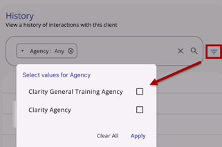
When you select a filter that has multiple options, a filter menu pop-up appears with all available values for the field. Click Apply when you have made your selections.
Users can review, edit, or clear previous selections by clicking on the filter within the Search bar.
- Review: Users can click outside the filter menu box (or click Apply) after a review without changes to leave selections as they are.
- Edit: Users can make changes to their original selections in the filter menu and click Apply to make updates to the filter.
- Clear: Users can click Clear All to remove selections, and refresh the table.
Once you have selected one filter, you can add more if needed.
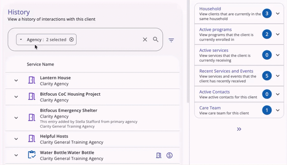
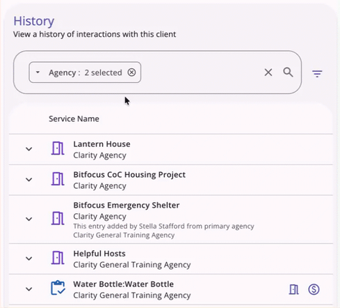
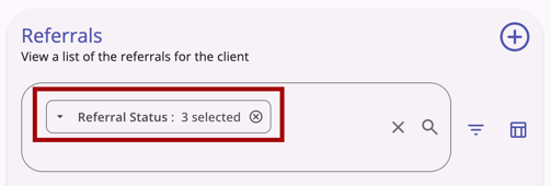
When more than one value is selected within the same filter, the chip shows "[Filter title]: #Selected." For example, you will see "Referral Status: 3 selected" if you select 3 of the referral status values for the multi-select Referral Status filter on the client’s Referrals tab.
When multiple values are selected in the same field filter, the system uses OR logic to filter results that contain any of those values.
- OR logic only applies to multiple values selected within the same field filter.
- Per current functionality, the system will use AND logic across multiple field filters.
This feature is found on the following pages:
- Referrals > Incoming Referrals
- Referrals > Community Queue
- Referrals > Outgoing Referrals
- Referrals > Availability
- Referrals > Snoozed
- Clients > History
- Clients > Files
- Clients > Forms
- Clients > Location
- Clients > Referrals
- Clients > Restrictions
- Clients > Programs > Files
- Clients > Programs > Forms
Sorting
Sorting options are available throughout the new Clarity interface to help you customize search results. This icon indicates sorting options:
Users can select multiple fields to sort by and can click and drag fields to set the sort order.

The available sorting options will vary depending on where you are in the system.
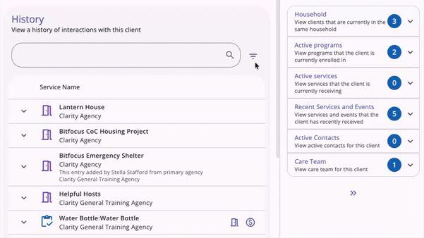
Widgets and Cards
Widgets appear throughout Clarity and provide information at a glance, with more details when clicked. Each widget typically displays the name indicating the record type and a number indicating the number of records in the widget.

Caseload Widgets
A user’s caseload information is always visible in the widgets on the Clients search page, within a specific agency, on the right-hand side of the page.

Each widget displays a number, the widget's name, and an info icon. For more information on caseload widgets, refer to the Caseload Management article.
Client Details Cards
On the right side of the client record are the Client Details cards, which contain additional or summary information about your client. Each card contains a circle with a number indicating how many items can be viewed when the end user clicks the drop-down arrow.

Learn more about each card in the Client Details Cards section of the Client Record Overview article.
Updated: 06/09/2026