
Table of Contents
- Overview
- Client History Tab
- Standardized Icon Popovers
- Program Popover
- Referral Popover
- Characteristics Popover
- Expense Popover
- Location Popover
- Note Popover
- Privacy Popover
- Household Popover
- Search, Filter, and Sort
- Expanded Row Content
- Client Search Table
- Back Button on Multi-Step Forms
- Exceptions to Clickable Behavior
Overview
Data tables throughout the client record, including Client > History, Client > Programs, Client > Services, and Client > Units/Beds, share a consistent set of behaviors for clicking into records, viewing icon popovers, and searching, filtering, and sorting results. This article describes those shared behaviors.
Note: The tabs and sections available to each end user are determined by the community's system administrator. If you think you are missing a section necessary for your workflow, please reach out to your system administrator or agency contact.
Client History Tab
The History tab is the central hub of the client record. It includes a complete history of service items, program enrollments, referrals, reservations, and assessments recorded in a client record.
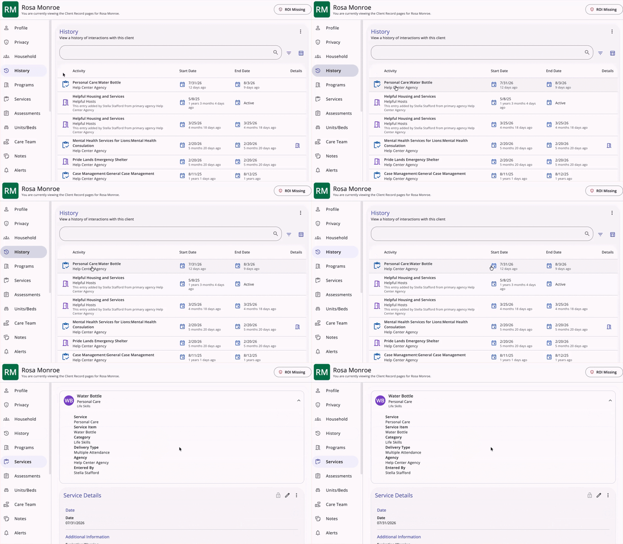
Clickable Rows
Clicking any row in the History table opens that item's detail page.
Column Headers
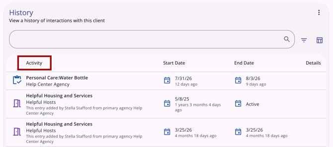
The History table includes the following default column headers:
- Activity: The name of the service, program, referral, or other item in the list.
-
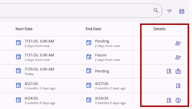
Details: The far-right column, containing indicator icons for the item.
Column Sorting
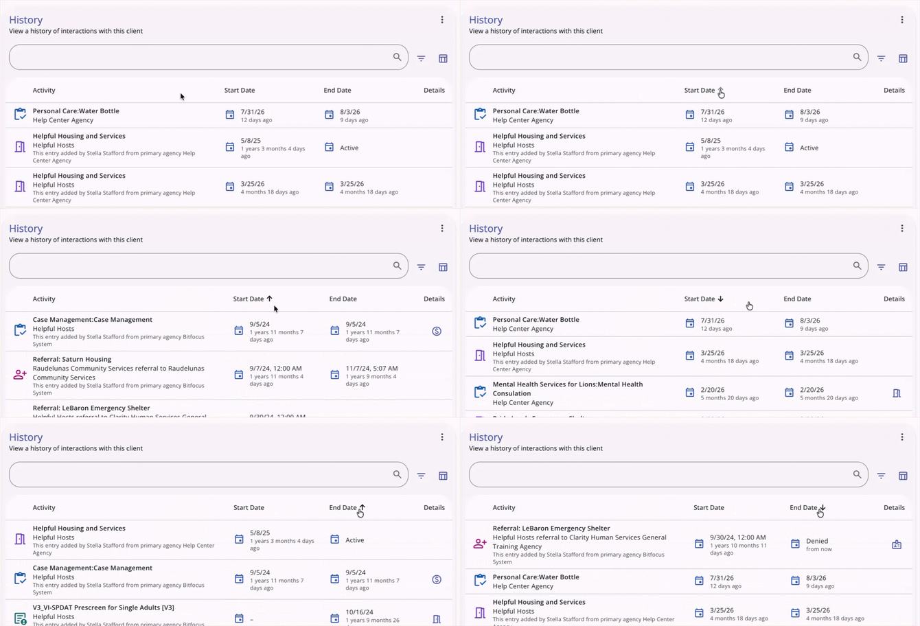
The History table supports standard column sorting:
- The list is sorted by the Created date by default.
- Hovering over the Start Date or End Date column header displays a gray upward-pointing arrow.
- Clicking the arrow sorts the list by that field in ascending order. The arrow turns black and remains visible even when you are not hovering over the column.
- Clicking the arrow again sorts the list in descending order and changes the icon to a downward-pointing arrow.
Referral Status Display
If a row is a referral with no end date, the End Date column displays the referral's current status.
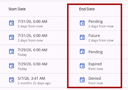
For example:
- Active referrals display "Active."
- Snoozed referrals display "Snoozed."
- Pending referrals in process display "Pending - In Process."
- Pending, Future, Completed, Expired, and Denied referrals display their respective status in plain text.
Standardized Icon Popovers
Indicator icons share a consistent hover and popover style.
Hovering over an icon displays a dark purple border and a light purple background. Dark mode is also supported.
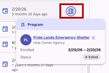
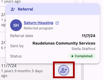
All referral-type icons (Linked Referral, Referral, Pending Referral, Denied, Expired, and Future Referral) use a single, standardized person-plus icon. Differentiating information for each referral type is available in the popover content rather than in the icon itself.
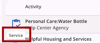
Note: Tooltips, which are purely informational and distinct from the interactive popovers described in this section, display in a consistent style: black text on a white background in a speech-bubble format.
Program Popover
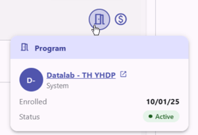
Hovering over the Program icon displays:
- Each program's name (bold) and agency (gray), with the name hyperlinked to the program's detail page
- Enrolled and Status rows, with the enrollment date formatted as M/DD/YY
- If the program has an exit date, the enrollment row displays the enrolled and exited date range, and the status row reads Exited
- An Active status displays in green text on a light green background; an Exited status displays in gray text on a light gray background
- A link to view the program detail page.
- If more than one program is linked, a subheader showing the total number of linked programs with each program’s details is listed on the popover.
Referral Popover
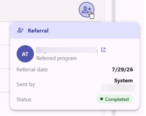
Hovering over the Referral icon displays:
- The referred program name, hyperlinked to the referral's detail page
- A Referral Date row
- A Sent By row showing the referring agency and staff member
- A Unit/Bed row, if applicable
- A Status row showing the referral's status. Pending referrals also display how long the referral has been pending.
- If more than one referral is linked, a subheader showing the number of linked referrals and each referral’s details is listed on the popover.
Characteristics Popover
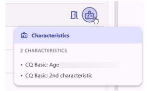
Hovering over the Characteristics icon displays a light purple header labeled Characteristics, a subheader showing the number of characteristics, and each characteristic listed as a purple bullet point.
Expense Popover
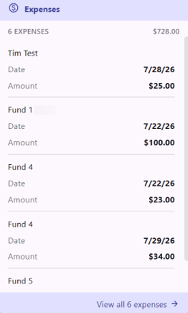
Hovering over the Expenses icon displays:
- If more than one expense is linked, a subheader showing the number of expenses and their subtotal.
- Each expense's name, date, and amount.
- A footer reading View expense detail (or View all [number] expenses if there are more than 5) that links to the associated service record.
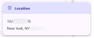
Location Popover
Hovering over the Location icon displays a bold, purple Location header and the client's address.
Note Popover
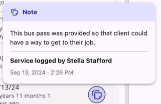
Hovering over the Note icon displays:
- The note text
- The name of the person who wrote the note and the date/time it was written
- If there is more than one note, a footer reading View all [number] notes that links to the associated record
The popover displays the most recently written note. For service records, which do not track a note author, the details section reads Service logged by [Name].
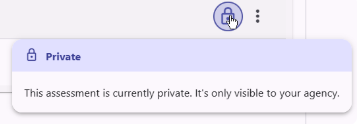
Privacy Popover
Hovering over the Privacy lock icon displays the privacy status. The message displayed depends on the privacy status.
Household Popover
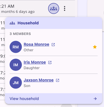
On the Client Search page, hovering over the Household icon displays:
- Each household member's name, hyperlinked to their client record.
- A Star icon next to the Head of Household's name.
- The relationship type for each member, listed in gray text below their name.
- A footer reading View household that links to the household page.
Note: All popovers are mobile-responsive. On mobile, tapping an icon opens the popover, and tapping the icon again, the close (X) icon, or anywhere outside the popover dismisses it. Long lists scroll within the popover body instead of being truncated.
Search, Filter, and Sort
Data tables throughout the client record follow a consistent pattern for search, filter, sort, and column visibility:
- Free-text search in the search input.
- Column-level filters accessible via the Filter icon.
- Sort configuration via the Sort icon.
- Show/hide columns via the Column Selector icon.
- Active filters displayed as removable, editable chips within the search bar.

Where applicable, filters support multi-select, including fields such as Service Type and Category.
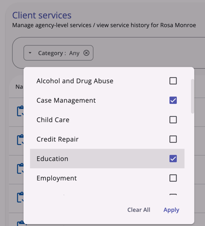
This pattern applies to the following tables:
- Client > History (Sort, Search)
- Client > Programs (Search, Filter, including a Program Type filter and show/hide column)
- Client > Services (Search, Sort, Filter, including a Category filter and show/hide column)
- Client > Notes (Search)
- Client > Program > History (Filter by type)
- Client > Program > Services (Search, Filter by Category)
- Client > Program > Notes (Search)
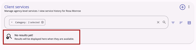
Tables with no results display the standard empty state: "No results yet! Results will be displayed here when they are available."
Expanded Row Content
Expanded table rows display human-readable, workflow-relevant information rather than raw system metadata (such as internal IDs). If a table row is expandable, an Expand/Collapse (chevron) icon is shown for that row.
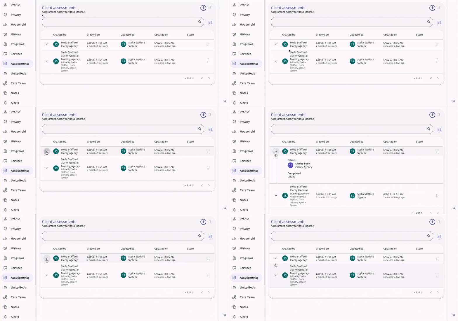
If a row's potential expanded content consists entirely of system metadata with no other value, no Expand/Collapse (chevron) icon is shown for that row.
This applies to the following tables:
- Client > Privacy
- Client > Program
- Client > Services
- Client > Assessments
- Client > Notes
- Client > Files
- Client > Location
- Client > Program > Assessments
- Client > Program > Notes
- Client > Program > Files
- Client > Program detail view header bar
- Referrals > Unit Queue
- Referrals > Availability
- Referrals > Referral Detail > Notes
System-generated fields not shown by default remain available through each table's show/hide fields option in the column selector. If you use the column selector to add one of these fields to a row's expanded view, the Expand icon appears for that row.

Note: The system will remember your table column display preferences when you log into your account from the same device. You can update the fields again using the Column Selector (Show/Hide Fields) icon in the search and filter header. If you use a different browser, the default files will show.
Client Search Table
The main Client Search table and its advanced filter menu include:
- An advanced filter menu with the full list of fields available in the show/hide column selector menu.
- Sort functionality within the filter menu.
- Default columns of Client name, DOB, SSN, Updated By, Updated On, and Details.
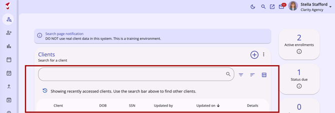
Note: Household information for a client is available in the Household icon popover rather than as a column on this table. Refer to the Household Popover section above for more information.
Back Button on Multi-Step Forms
Multi-step forms across the client record include a Back button so you can move between steps to review or edit previously entered data.
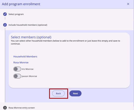
- The Back button does not appear on the first step of a form.
- Data entered on a previous step is saved as you move forward, unless you exit the form without saving.
- The final step of a form includes Cancel, Save, and Back buttons.
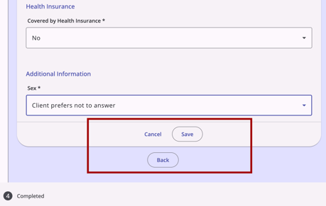
This behavior applies to forms such as Client > Programs > Add Program, Client > Programs > Add Forms, and Client > Add Assessment, as well as any other multi-step form.
Exceptions to Clickable Behavior
On Referrals > Community Queue > [Queue name] > [Client name] Referral detail pages:
- The History section of a referral does not display a clickable-style cursor when hovering over items in the table, since these items are not clickable.
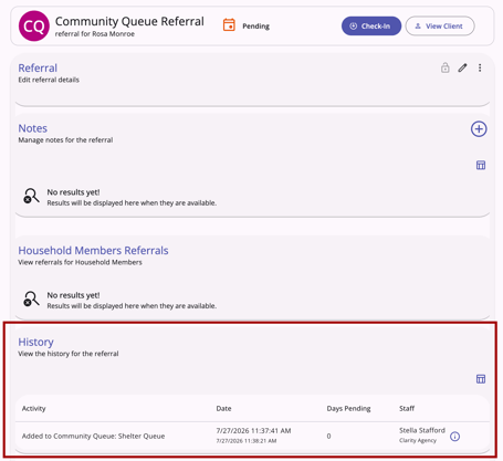
- The Calendar icon indicating the status of a referral in the top information box of a referral does not display a clickable-style cursor, since it is not clickable.

Published: 08/13/2026