
This article is for the new Clarity interface. Screenshots and descriptions will be updated as features are released.
Table of Contents
- Overview
- Navigation
- Client Search
- Client Header
- Search, Filter, Sort, and Column Controls
- Row and Icon Interactions
- Program Details
- Tables and Forms
- Referrals
Overview
The new Clarity interface is optimized for mobile devices, making it easy to navigate, search, and manage client records. This experience includes the main navigation bar, client search, client records, and data tables.
Note: The features available to each user are determined by the community's system administrator. If you think you are missing a section necessary for your workflow, please reach out to your system administrator or agency contact.
Navigation
The top navigation bar is sized so that all icons are fully visible.
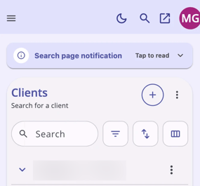
- The right side of the navigation bar shows the dark/light mode icon, the search icon, and the logged-in user's initials.
- The Navigation Menu icon is always available on the left side of the navigation bar.
- When there are additional navigation pages, an action menu, a dropdown arrow, or the icon of your current page, it shows your location at a glance. Tapping the action menu opens a list of all navigation pages, allowing you to easily jump to other recently viewed pages.
- Dropdown icons do not display next to menu items that don't expand into a submenu.
- Opening the navigation menu automatically closes the info menu, and vice versa, so only one is open at a time.
- Mobile pages always load with any side menus collapsed.
Client Search
The Client Search page is designed for mobile use.
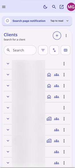
- Each column in the client list can be viewed without horizontal scrolling, on any screen size.
- Tapping anywhere to the left of the client's image or icon expands that row inline.
- Caseload statistics display below the client list in a Caseload Summary section:
- The number is left-aligned.
- The card title displays in bold to the right of the number.
- A description displays below the title in gray text.
- A link-out icon displays on the right side of the card, linking to the related page.
- If a system notification or admin message banner is present, it displays above the main client table header in its own mobile-friendly, collapsible section.
- Tapping any status indicator icon on the right side of a table row (housing status, household, etc.) opens the tooltip with full details.
Client Header
The client header shows only essential information by default.
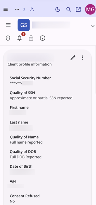
- The client header displays in a compact format showing the client's name, client image, and an expand chevron. Tapping the chevron expands the header to show additional information.
- Informational icons in the client header (privacy lock, ROI shield, contact phone icon, etc.) are available on mobile.
- Tapping a warning icon opens a bottom-sheet popover with information related to that warning.
Search, Filter, Sort, and Column Controls
The search, filter, sort, and show/hide column controls fit on one line.
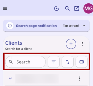
Tapping the filter, sort, or show/hide columns icon opens a bottom sheet.
- Show/Hide Fields: Supports drag-and-drop reordering when the tap-and-hold is on the item's drag handle.
- Filters:
- Shows a list of filterable options.
- Selecting a filter option opens a submenu showing the list of values for that filter.
- A breadcrumb header shows the name of the filter, with a back arrow (
<) to return to the main filter option list. - Each list item has a checkbox that applies as a filter when saved or applied.
- Sort:
- Opens as a bottom sheet listing sortable fields, with the current sort indicated by highlight.
- Each field has two pillbox options, Ascending and Descending, with the active option highlighted.
- The active sort field displays in light purple, bolded, with a purple checkmark on the right side of the list.
- A sticky Clear all and Apply footer is always visible at the bottom of the filter sheet, regardless of option count. The sheet header (title, close icon, and search, when applicable) stays sticky at the top for any scrollable lists. This convention is used across all mobile footer modules in the new Clarity interface.
Row and Icon Interactions
Tapping icons and chevrons behaves predictably throughout the mobile interface.
- A single tap on a sort, filter, or show/hide column icon opens the menu in a bottom sheet.
- A single tap on an icon with a popover opens that popover in a bottom sheet.
- A single tap on an icon whose tooltip is strictly a label or description does not display a tooltip on mobile. If the icon shows information beyond the title (for example, the privacy lock icon), the system shows the full popover instead.
- Tapping an expand chevron on a table row (or the area to the left of the item's title or image) expands that row inline — it does not navigate to the record.
- Navigating to a record requires an explicit tap on the row's label and description area (generally the center of the row, or the whole row if there are no kebab or indicator icons on the far right).
- If there is no additional information to display, the expand chevron does not display.
- All table rows are collapsed by default.
Program Details
The client's program details are easy to navigate.
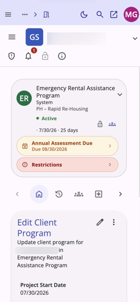
- The program details banner is optimized for mobile, with compact information available by default.
- An Annual Assessment Due notification displays as a warning banner in the program detail box when present.
- The program subheader navigation row fits within the mobile view. The menu can be navigated with the left or right arrows, or by horizontal swipe.
- Program details can be scrolled past.
Tables and Forms
The mobile experience supports working with data-rich tables and forms.
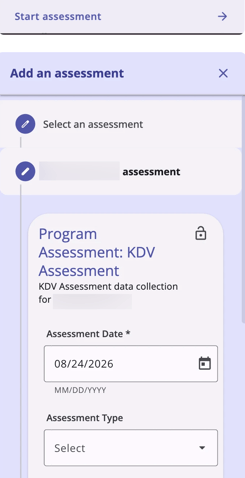
- All tables are readable without horizontal scrolling.
- Context and function buttons are accessible, with correct spacing between them.
- Side-sheet forms open in full width, with all fields accessible so that users can enter client data without issues on a phone.
- In data-heavy tables, the From Values column is pinned on the left, while the remaining columns (To Values, Changed By, Date) scroll horizontally.
Referrals
Referral pages are fully mobile compatible, using the same standard mobile conventions as the client pages.
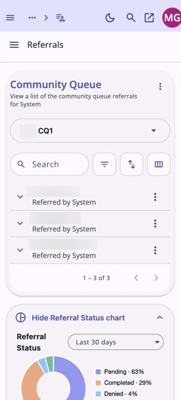
- The community queue filter now opens as a bottom sheet with all options visible.
- The referral status infographic fits within the viewport on one screen and can be expanded or collapsed.
Updated: 10/01/2026